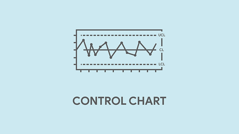
CONTROL CHARTS: GIVING YOU CONTROL OF YOUR PERFORMANCE IMPROVEMENT DECISIONS
Control charts employ statistics to help you gauge if your process measures require intervention. They allow you to track the effects of a quality improvement measure on the data and to respond to multiple data points instead of just an unfortunate case or data point. As a result, you review individual cases in relation to trends from other cases to decide if a process is working for your program or if it’s time for a change. This tool allows you to analyze and react to trends rather than allowing the last challenging case to overinfluence your team discussions.
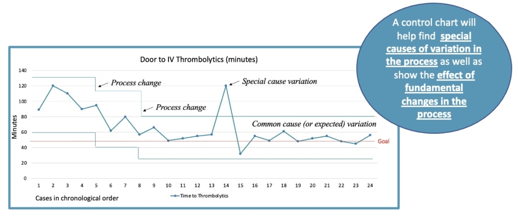
Timeliness data (e.g., time-to-thrombolytic, time-to-groin puncture, etc.) are perfect processes to monitor using control charts. Surprisingly, few stroke programs use control charts. This may be because it requires some statistical knowledge and excel spreadsheet skills. But once you learn how to build a control chart using Excel, you can quickly convert your standard line graph into a control chart
We developed an Excel tool and training webinar to help you learn how to build and master control charts. We give you an Excel template already populated with the statistical formulas and “mock” data. The webinar walks you through building a control chart with the Excel template. You can also cut and paste your Stroke Log data into the Excel template and build a control chart displaying your own data! Learn more about the webinar here.
We offered this training in a virtual workshop in January and got some great feedback that we’d like to share with you:
“The workshop was perfect. Very informative. I liked the fact that the spreadsheet had a built-in tab illustrating the formulas and the cells. Very easy to follow.”
“Very straightforward and easy to understand!”
“Easy to follow and understand! Excellent workshop!”
“I really liked all of this workshop. I use these charts all the time but even the review of the basics was great. I never knew the difference between a histogram and bar chart.”
“Great job, very helpful information and relevant examples.”
Thank you to Dale Strong at Spinnaker Health Care Solutions for collaborating with us to develop this webinar and to ABBVIE for sponsoring the live workshop.
 Stroke Challenges